

Crafting with limitations and disabilities is possible. With this blog, I am creating a record to show how I am overcoming my disability and using it as a motivation to become a better crafter. I hope my story helps others who may be in a similar situation. My tools, my hands. Crafting with limitations and disabilities is frustrating and can be very painful. The most important tool we CAN use is our determination. Click on a picture on the slideshow to view an enlarged image.
Wednesday, March 9, 2011
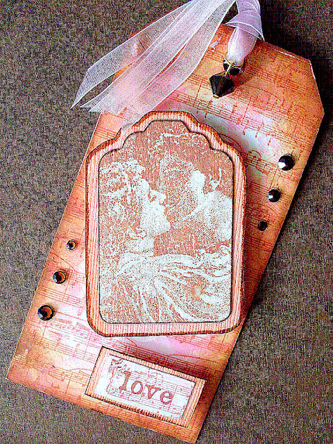
Love tag
Today I completed the tag for the last word stamp in the box. Love: a lover's kiss with a symphony of music notes in the background. A tag within a tag, inking, crystals and gossamer ribbon..... such is love.
Beauty tag
Almost done. This was a stamp I have been waiting to find a place to use it. Water colors, metallic watercolors, beads and ribbon. Took longer to dry than to paint. I love it.


Monday, March 7, 2011
Journey tag
My all time favorite stamp! 'Umbrella Man', traveling vibe, map, numbers, a few metal pieces and layers of distressed inks... vintage Holtz!
Stamp coastline map on tag with Timber Stazon. Using DI and cut and dry foam, color map with Broken China, Bundled Sage, Vintage Photo and Mustard Seed. Over stamp 'umbrella man' with black archival ink. Edge tag with 'map tape'. Stamp 'journey' on same tape, adhere to card stock, trim and mount on tag with foam tape. Add metal elements to 'Holtzerize'.

Stamp coastline map on tag with Timber Stazon. Using DI and cut and dry foam, color map with Broken China, Bundled Sage, Vintage Photo and Mustard Seed. Over stamp 'umbrella man' with black archival ink. Edge tag with 'map tape'. Stamp 'journey' on same tape, adhere to card stock, trim and mount on tag with foam tape. Add metal elements to 'Holtzerize'.

Truth tag
Almost done with the box of words.
How do we visualize truth? guarded from wrong doers? or caged in by the same?
How sad we cannot just bust open the gates of truth and freedom.
Let people be, let the truth be our moral standard.


How do we visualize truth? guarded from wrong doers? or caged in by the same?
How sad we cannot just bust open the gates of truth and freedom.
Let people be, let the truth be our moral standard.


Monday, February 28, 2011
Explore tag
Another tag! Using Espresso, Meadow and Sail Boat Blue alcohol inks I did the 'polished stone' technique on glossy paper, selected a good section, adhered to my tag and trimmed. Stamped the tops of trees with Stazon Forrest and flying birds with Stazon Ultramarine. Stamped 'explore' with the same color on a scrap of polished stone paper, trimmed and matted with dark blue card stock. Edged the entire tag with a Le Plume navy marker. Using Sail Boat Blue ink I colored and heat set the metal bird charm (Tim Holtz) and added a peach flatback crystal to the eye. The speckled effect is created with Denim Stickles rubbed very thin across the tag with the pad of a finger. Mount the caption with foam squares, thread matching ribbon through the charm and then the hole in the tag.


Saturday, February 26, 2011
Believe tag
'Believe' hits home. My mother is a breast cancer survivor. After the surgeon told us to say goodbye to grandmama because chances of coming out of surgery alive were almost none. If she did survive it, going home in a week was a fat chance; if she did make it home, recovery would be slow and difficult. Chances of survival at her age (75), with the type of cancer (stage III) and the type of surgery (full mastectomy)... were against her. Its been 5 years and she lives a full life. This one is for you mom. Simple and understated.


Friday, February 25, 2011
Sun and Moon
Workout for the hands! Sun and Moon people created with polymer clay, a doll armature, fabric spray paint and silk flowers. The Sun has Perfect Pearls kissed cheeks, lips and eyes. The moon was made with glow in the dark polymer with a bit of black embossing powder mixed in. For the faces I used a mold and then altered a little, the hands and feet were all hand made. Leftover ribbons were used for the cape and the skirt. Glossy Accents was used as the adhesive for everything, including the Austrian crystal flatbacks.


Journey
The birds on this card were stamped in different angles with Stazon Timber ink on antique looking wallpaper. Then trimmed and matted with sage flourish paper leaving space below. Printed the caption on vellum, trimmed and attached to the bird layer with brads. Stamped Enjoy the Journey and the birds on a wire on the sage green paper then adhered to base. Using Vintage Photo DI, roghly edged around the base card. Finally, using Glossy Accents, filled in 2 of the flying birds and all the birds on the wire.

Sunday, February 20, 2011
Inspire tag
Working my way through the box of word stamps... this is Johannes Vermeer's 'Girl with a Pearl Earring'. I got the stamp and could not wait to use it. The look is baroque and saturated, good match for the stamp image. Here is how to make it:
Stamp 'old German text' directly on the tag with archival ink, let that dry and then use Chipped Sapphire DI to edge the tag. Separately stamp a couple of generations of a 'busy' text on a slightly darker than manila paper (you can see the edge above the stamped image is a little darker than the tag itself) using coffee colored ink. Then over stamp the girl with black archival ink and the word 'inspire' on a scrap. Use pen nibs to lightly color the headband with Chipped Sapphire, the eyes with Bundled Sage, the lips with Worn Lipstick and the cheeks with Spun Sugar Distress Inks. Touch all edge of the girl scrap with Tea Dye using Cut and Dry foam, then adhere to tag. Mat word and on manila scrap, trim to fit inside the girl layer, sand edges and edge with Chipped Sapphire and Tea Dye. Adhere the word to the tag with foam squares. Add a half peal embellishment on the earring and around the tag hole, then thread matching ribbon on the tag.

Stamp 'old German text' directly on the tag with archival ink, let that dry and then use Chipped Sapphire DI to edge the tag. Separately stamp a couple of generations of a 'busy' text on a slightly darker than manila paper (you can see the edge above the stamped image is a little darker than the tag itself) using coffee colored ink. Then over stamp the girl with black archival ink and the word 'inspire' on a scrap. Use pen nibs to lightly color the headband with Chipped Sapphire, the eyes with Bundled Sage, the lips with Worn Lipstick and the cheeks with Spun Sugar Distress Inks. Touch all edge of the girl scrap with Tea Dye using Cut and Dry foam, then adhere to tag. Mat word and on manila scrap, trim to fit inside the girl layer, sand edges and edge with Chipped Sapphire and Tea Dye. Adhere the word to the tag with foam squares. Add a half peal embellishment on the earring and around the tag hole, then thread matching ribbon on the tag.

Thursday, February 17, 2011
Spoiled
In my SDU class I teach the use of different elements in the same scrapbook page. This layout shows the combination of different papers and how single and double mats make the pictures stand out. The background is created with 2 overlapping scraps over the checkered base. The lateral edges are lined with paw print ribbon; the dimensional letters of the title and the doghouse sticker offer an element of fun. The title was placed at the bottom, proving not all titles need to be on top of the page. Writing on the transparency on top completes the dimensional effect.


Wednesday, February 16, 2011
Dream tag
Another tag is done! Bad week for my hands, having a hard time closing my finger and putting pressure on the stamp, so this is my third attempt and I did not botch it. Score!
Cover tag with harlequin paper, scratched a bit to distress and stamped the masked lady on light blue cardstock using archival ink. Tore the edges a little, then matted with deep teal card stock. Stamped 'dream' on a green scrap from the same paper and mounted with a foam rectangle. Then I attached the masked charm where I had glued teal crystal flatbacks.

Cover tag with harlequin paper, scratched a bit to distress and stamped the masked lady on light blue cardstock using archival ink. Tore the edges a little, then matted with deep teal card stock. Stamped 'dream' on a green scrap from the same paper and mounted with a foam rectangle. Then I attached the masked charm where I had glued teal crystal flatbacks.

Wednesday, February 9, 2011
Paris
Paris... nothing needs to be said. But lets explain the layout as an example. Again, this is a double spread I use when teaching. The background pages are not identical; however, they have the same color hue and this allows for the combination to work well together. The diagonal and overlapping pictures of the Eiffel Tower are single matted, this emphasizes the fact that ts is the same subject and ties with the printed image on the paper. The picture on the upper left was taken at night so a double mat was used to isolate it within the arrangement. The second page shows other scenes, all matted with the same colors. To create something unexpected, I tore the edges of the focus picture, attached a garter, a charm and slanted the picture. Using the Cricut created a tag with 'je t'aime' in black and threaded a street light and flag through it. To break the vertical lines, it was adhered on a slant with foam squares. To complete the layout, I used many small embellishments, related stickers, cutouts on pop dots, tied narrow red ribbons here and there... and stamped 'Oooh la-la!' below the garter. The final touch was to label the scenes with a Dymo in black. Paris, je voux retourner...


You are my Sister
This is an example I use for the classes I teach; it is a double layout in an asymmetrical composition. Vibrant colors and many pictures with opposite flourishes touching pictures, enough area for the eyes to rest and a pile of flowers to embellish. The corner golden squares draw out the golden flecks of the paper. All the pictures are double matted with coordinating colors, the first layer has decorated paper, the second layer is solid card stock. The title spans across both a pages and is anchored with the vertical stripe paper on which I adhered letters cut wit the Cricut.


Imagine tag
This tag has a steam punk bend. The classic Gibson girl with sprockets, gears and cogs. From the bottom up: used Clock works embossing folder on textured grey card stock with white core and sanded. Trimmed and adhered to tag. Stamped Gibson girl on glossy paper with archival ink, retouched with Spun Sugar, Worn Lipstick and Broken China Distress Inks. Trimmed close to image and adhered to black card stock edged with Pirate gold ink, trimmed that to fit inside tag. Same ink used on black rectangle. Stamped 'imagine' with silver on black card stock. Trimmed and mounted with foam squares. Adhered a silver gear. Separately, stacked cog and gear and attached to tag with brass brad. Another stack with gear, cog, game spinner and brad was centered on the the girl's head after drawing a brass circle with metallic ink. Attached another gear to the tag hole through the string.


Sunday, February 6, 2011
Simple and Bright (for sure!)
Itching to try a MS ribbon punch I started trying out colors. This periwinkle looked soooooo sweet and I had a fabric ribbon in the same color. Made a card using lime green Bassill textured card stock. Adhered a magenta rectangle 1/4" smaller all around and then I topped it with a pumpkin yellow card stock that I ran through a texture wheel. Cut that a hair (wow, how technical is that description) shorter than the length of the magenta rectangle but 1" narrower on either side. Adhered the corrugated panel with glue dots. Centered the MS punched ribbon and the fabric ribbon (made a bow and dove tailed the ends first) and adhered those too. Then on a scrap of the green card stock I stamped 'Cherish' with gold, trimmed, matted with pumpkin texturized paper, trimmed that and mounted on the card.


Pastel Squares
This card was made with leftover paper from the previous card posted. I glued the french flourish paper to a basic card. I used a stamp (Hampton Arts) with several 'almost' inch vignettes, on white cardstock. Using pastel colors, each square was colored and then sealant was applied. Since the vibrancy of the colors was not coming through, I decided to try laminating with a Xyron and that did the trick. The colors popped. Trimmed the vignettes very close leaving an eyelash of white around. Carefully measuring the location, I adhered each square with foam squares to raise them and create some depth. Then I notched top and bottom and tied a silver round ribbon. Easy peasy.

Sunday, January 30, 2011
Dimensional Hearts
A little more complicated than my usual. The key is to measure and center correctly. Using a black card as a base, I rounded all the corners and then glued a french toille paper and edged with a dark pink metallic ink. Then glued down the middle a strip of metallic red paper. Separately, punched out 1" black card stock squares, metallic red hearts and white hearts. Glued the hearts onto each square and then pierced the squares (top one only on one side) and using 8mm silver jump rings connected the strip of hearts. Put a foam dot under each square and adhered down to the red strip. Added two crystal dangles at the bottom.


Colour My World!
All bright and happy colors. Very fast and fairly simple card. First I created a layer of paint chips in a rainbow pattern. Trimmed lengthwise in half and glued to a black card. Stamped a large flourish off center with archival ink. With the other half of the paint chips, created top and bottom ribbons in the same rainbow pattern. Using computer font, typed and printed on vellum the lyrics for Chicago's "Colour My World" (left justify), and adhered to the inside of the card. Trimmed with the rainbow ribbon on the top and bottom, then stamped two smaller flourishes with archival ink.


Be Mine in sepia
This card is made with a base card on copper. Adhere flourish pink paper inside. On glossy paper stamp lovers with sepia ink, trim close and adhere to black mat and trim, then adhere to flourish paper and trim again. Notch corners with punch and thread copper floss to frame the image. Adhere to card with pop dots. Trim a rectangle out of the flourish paper with Victorian edge scissors and also trim off 1/4" off of the side of the card. Write 'Be Mine' on the rectangle with copper metallic ink. Make a boutonniere with small silk flowers and tie with complementary ribbon, then adhere to card.


Vintage Love
This card is all things old and soft. A basic black card is covered with light pink paper and then deep red card stock leaving 1/8" all around. Then a layer of decorated paper - cut 1" smaller- anchored top right is glued to the red. Using a word stencil (I make my own with a font cartridge and Cricut) sponge dauber and chalk ink (merlot) sponge text on card. Punch chain piece from red card stock and glue diagonally. Glue skeleton key the end of the chain. Punch/emboss leaves from text printed paper and edge with chalk ink (merlot). Using graduated layers of silk flowers, ink edges with the same ink, heat set, stack and attach with brad.

Je t'aime card
Such pretty graphics in this paper... using light sage card stock I created a double-door card slightly overlapping. Adhered the Victorian rose paper to the outside, leaving 1/2" on the center joint. Using Crushed Olive Distress Ink and Cut and Dry foam, edged all the way around. For the inside, attached a vellum rectangle in the center panel with brads and slide a piece of the rose paper underneath and adhere. Edged all around card and Victorian paper with Crushed Olive. On another velum rectangle, stamped and embossed text with Dusty Rose Distress Ink and detail clear embossing powder. Matted with light sage card stock, trimmed and very lightly edged with Olive ink using a foam dauber, then adhered to center panel with pop dots. Using a fabric marker in dark rose, hand wrote "Je t'aime" on satin ribbon, dove-tail one end and glued to card. Using MS's Lacy Heart punch and vellum, punched a heart; matted on dark red card stock and trimmed closely with scalloped scissors. Inked the edges very lightly with Victorian Rose and glued to card using pop dots. Attached 'knobs' (Tim Holtz) and tied pink sewing floss with beads on the ends.


Friday, January 28, 2011
Create tag
Creating is fantastic. We try one way or another to create something. New dishes, a dress, a home, a career... but the most amazing quality we have is the ability to create life. Not all of us chose to do so. Those who do, are forever responsible of that life. This tag starts out by drawing a human to be. What a challenging proposition! Lots of research on-line and finally, I drew the embryo concept on paper, cut with an x-acto knife for precision and then glued that to heavy card stock. Cut again and edge with Antique Linen Distress ink. Stamped old German text with archival ink. Position it on the tag and lightly trace with pencil. Covered the tag with very light green flourish paper, stamped the sun with Wild Honey Distress ink and heat embossed with detail powder. Using Stazon yellow ink and a nib, detailed the silhoute and the sun. Using Wild Honey and Cut and dry foam, edge tag. Then lightly edge with Milled Lavender. Stamp 'create' with Wild Honey towards the middle. Using Eggplant Alcohol ink, dribble over a few frosted glass leaves, heat set and then with a paper towel with one drop of alcohol, wipe the tops of the leaves so only the veins are stained. String on a wire to create a circle and thread into the tag's string.


Free tag
Working my way through the box of word stamps, I am on the 4th one... FREE... what is freedom? The ability to think the way you want, express yourself and go where you want, but mostly, it means to be yourself without restrictions.
On this tag I covered the base tag with small detailed card stock and heat embossed a Victorian birdcage -slightly off center- with copper. Using Stazon purple, I stamped the butterfly with the swirls still on the cage. Edged the whole tag with Concord Grape Distress ink and lined the butterfly stamp with a glazing pen. Punched a 'stamp' using MS punch and stamped 'free' with white Stazon ink, adhered with foam dot. Also a MS punch is the monarch butterfly punched from lavender vellum and glued to a sliver of foam. Perked the wings and its ready to fly. Punched out 2 different flowers, edged the largest with lavender chalk ink, stacked and added a rhinestone in the center. Adhered with a pop dot above the 'free' stamp. Added 2 small glass flower charms loaded on copper wire and attached to the string tag.

On this tag I covered the base tag with small detailed card stock and heat embossed a Victorian birdcage -slightly off center- with copper. Using Stazon purple, I stamped the butterfly with the swirls still on the cage. Edged the whole tag with Concord Grape Distress ink and lined the butterfly stamp with a glazing pen. Punched a 'stamp' using MS punch and stamped 'free' with white Stazon ink, adhered with foam dot. Also a MS punch is the monarch butterfly punched from lavender vellum and glued to a sliver of foam. Perked the wings and its ready to fly. Punched out 2 different flowers, edged the largest with lavender chalk ink, stacked and added a rhinestone in the center. Adhered with a pop dot above the 'free' stamp. Added 2 small glass flower charms loaded on copper wire and attached to the string tag.

Thursday, January 27, 2011
Discover tag
Another word from the set is done. The world is a place to discover talent, friends, languages, food, art, you name it! Having had the opportunity to do some traveling, I still crave it. Choosing a place, packing, planing the route, think of all the wonderful things to do... and we realize the journey already started.
After gluing a map over the base tag, used cut and dry foam to ink edges with Tea Dye and very little Vintage Photo. Stamped and embossed the 1/2 world with garnet powder. Masked and stamped all the postoids I own! Then took the cancellation stamp (wavy lines) and stamped it toward the bottom of the tag with bright red.
Separately, stamped 'discover' on a piece of the map with Timber (Stazon), trimmed and then glued to the bottom of the tag. Using Tim Holtz ticket dies and a strip of camel 'foamie' sheet, I got a good base for the ticket stamp (Tim Holtz) with Archival ink. Stamped 'YOU!' on it, trimmed around and glued to the tag. Then I stamped the cancellation mark on the ticket matching the original one on the tag. To complete the look, I attached a flower dangle to a mini compass and threaded through the string on the tag.

Wednesday, January 26, 2011
Passion tag
This one includes some of my favorites! First, stamped Girl in Wave using chalk ink (progressively darkened toward the bottom) trim and edged with Platinum. Glued to a larger piece of dark bluish card stock, edged that with a postage stamp punch. Separately, stamped 'passion' on the same color paper, trimmed and edged with platinum. Inked around the base tag with foam using Chipped Sapphire. Cutting a tag from Vintage Shabby, I trimmed 2mm around and distressed, then inked the edge with Broken China and adhered to the larger tag. Glued the stamped image at an angle and on top 'passion' with pop dots. Loading 2 headpins with tumbled sea glass I attached them to a jump ring and the tag. Finally, I glued a starfish charm tucked under the raised word.


Hope tag
A friend gave me a boxed set of stamps with one word statements. Maybe I'll work my way through the box and make tags with them...
For starters, we have HOPE. Stamped the keyhole face on transparency material with Stazon, cut and then glued that onto iridescent card stock, trimmed the edges and then carved the hole itself. Stamped the girl (gypsy set) in purple and masked. Added the flourishes with Pumice Distress ink and edged with Wild Honey and Worn Lipstick inks. Using brown I stamped 'hope' 3 times in different directions without reloading ink. I centered the key hole over the girl's face. made registration marks for alignement, pierced and by putting a 4mm bead under the keyhole I got the dimensional effect when I put the brads. The metal key was inked with Sunset Orange alcohol ink and heat set, then attached to tag.

For starters, we have HOPE. Stamped the keyhole face on transparency material with Stazon, cut and then glued that onto iridescent card stock, trimmed the edges and then carved the hole itself. Stamped the girl (gypsy set) in purple and masked. Added the flourishes with Pumice Distress ink and edged with Wild Honey and Worn Lipstick inks. Using brown I stamped 'hope' 3 times in different directions without reloading ink. I centered the key hole over the girl's face. made registration marks for alignement, pierced and by putting a 4mm bead under the keyhole I got the dimensional effect when I put the brads. The metal key was inked with Sunset Orange alcohol ink and heat set, then attached to tag.

Tuesday, January 25, 2011
Koi ATCs
These things can get addicting. How to create a calling card in a 2.5 x 3.5" piece of card stock? The possibilities are endless. For example, this is one of the Koi series I created using photo paper. First I did smoosh and swirl alcohol inks for the background and spritz it with light blue Perfect Pearls with a mister. Then, found a darker area that could be used as the bottom and hand painted reeds -kinda floating with the waves- and added a raised frame around (1/4" only) that I colored with pastel chalks. Separately, on transparency material I stamped the koi with black solvent ink and completed -very roughly- the rest of the body on the fish with Lumiere inks. Added a sprinkle of mini beads and using Glossy Accents I adhered the transparency -turned backwards- to the raised frame so the beads can move around. Stamped the letters on photo paper with a few stray reeds, added a page pebble over the letters and trimmed. Adhered with Glossy Accents.

On this ATC I used photo paper. I think it has a nice ripple effect when it is smooshed on alcohol inks. Alcohol inks (meadow) for the background -smoosh and swirl- and then a combination of lettuce, caramel (?) and slate -1 drop of each- painted the plants. Stamped the koi with black Stazon and again, Lumiere inks to complete the bodies of the fish. Trimmed the scene down and adhered with a Xyron runner to an orange piece of textured card stock allowing two sides to overhang and show 1/16" and then glued that to a dark teal piece of cardstock (2.5 by 3.5"). Stamped the letters on the same orange textured card stock, added page pebbles over the letters, trimmed and adhered. I love the ripple effect of the inks on the photo paper, it looks like water.


On this ATC I used photo paper. I think it has a nice ripple effect when it is smooshed on alcohol inks. Alcohol inks (meadow) for the background -smoosh and swirl- and then a combination of lettuce, caramel (?) and slate -1 drop of each- painted the plants. Stamped the koi with black Stazon and again, Lumiere inks to complete the bodies of the fish. Trimmed the scene down and adhered with a Xyron runner to an orange piece of textured card stock allowing two sides to overhang and show 1/16" and then glued that to a dark teal piece of cardstock (2.5 by 3.5"). Stamped the letters on the same orange textured card stock, added page pebbles over the letters, trimmed and adhered. I love the ripple effect of the inks on the photo paper, it looks like water.

Monday, January 24, 2011
Bee ATC
Oh yeah, this one came out right. Archival ink on glossy paper for the writing. Olive solvent ink for the measuring tape and then Wild Honey for the medallion bee. Added Distress embossing powder -Vintage Photo- and lifted the release crystals. Red Stazon for the cancellation mark. Distress ink -Vintage Photo- around the edges. A thin layer of Stickles over the wings. Bada-bing!


Bee-Day Card
My friend's b-day is right around the corner. So today I spent a great deal of time making this card using the Cricut. Not original, its a 'lift' from an excises we did in class. Can it get any more cumbersome to lift all the tiny pieces? Really! It can be very difficult for me to do this type of stuff. Gluing is OK if I run it through a Xyron machine, as long as I put the correct side on the glue... 5 bees later, here we go. The effort was worth it. She is worth it. I'll put it in the mail tomorrow.


Friday, January 21, 2011
Gauchos en la Doma
Or in a very lose translation to English, we could say Cowboys in a Rodeo. Except that its not a rodeo, and a Gaucho is not exactly a Cowboy. Still with me?
In class I use this layout as an example for a double layout. When I made it, the store had just received 'wood paper' and I got started. It punches crisp and clean, it does not curl when glued and it holds ink well as long as it is set, otherwise the ink bleeds. The grain and coloring of the wood is very appealing. It was the perfect medium to get a 'nature' theme going. Pulled the pictures of a Doma and matted those on wood paper with another layer for accent. Only the picture of the race (I reeeeeally like that picture) got a mat of alcohol inks (lettuce) swirled and air shot to create striations. I found a background that looks like tooled leather and built my pages on those... No need for a lot of text because the pictures told the whole story: agility feats. Highest straight-up jump, fastest horse, etc. giving me the opportunity to use bulleted text on raised tags. I distressed a bit the smaller journaling block and the tags with Ranger's Vintage Photo Distress ink. Straight from the pad to the edge of the wood and set. Great effect!


In class I use this layout as an example for a double layout. When I made it, the store had just received 'wood paper' and I got started. It punches crisp and clean, it does not curl when glued and it holds ink well as long as it is set, otherwise the ink bleeds. The grain and coloring of the wood is very appealing. It was the perfect medium to get a 'nature' theme going. Pulled the pictures of a Doma and matted those on wood paper with another layer for accent. Only the picture of the race (I reeeeeally like that picture) got a mat of alcohol inks (lettuce) swirled and air shot to create striations. I found a background that looks like tooled leather and built my pages on those... No need for a lot of text because the pictures told the whole story: agility feats. Highest straight-up jump, fastest horse, etc. giving me the opportunity to use bulleted text on raised tags. I distressed a bit the smaller journaling block and the tags with Ranger's Vintage Photo Distress ink. Straight from the pad to the edge of the wood and set. Great effect!


Lavender Rosette
This card has 5 layers of assorted papers and card stock. Starting with a copper base, then a purple layer, a cream layer -used the Martha Stuart punch around the corner 'bird' for this one- then lavender velum and again cream card stock where I stamped using Stazon purple ink. The accents are mostly from Tim Holtz lines: the rosette in lavender vellum; then metal pieces in copper: mini paper clip, key, key hole and the thingy to hold the key (forgive me for getting so technical!). The ticket that I clipped to the rosette was stamped in purple and embossed in clear.


UTEE pool for Clio
This piece was very easy to make. A polymer clay little goldfish named Clio. A pool to hold her... that is a simple rectangle with edges, but I used a color progression (Skinner blend) to give the impression of deeper water on one side. Then the fins... paper thin and about 1.5" for the tail and a little smaller for the other fins, veined and edged them (although the edge did not come out the way I wanted... scissors are not my friends). Baked those separately and once the fish was assembled, I filled the pool with Ultra Thick Embossing Enamel and started to melt it with a heat gun. Once it puddled, I set the fish in the middle and added more UTEE. 3 minutes in the oven finished the job and Clio got her water. I opened the oven door and let the piece cool for 30 minutes before handling; the UTEE is like molten wax, burns, blisters, and you cannot lift it off of carpet (trust me on that one).

Thursday, January 20, 2011
Painting with Foam
Yep, took a regular dense foam and colored this one. The image is a set of stamps that offer a collage related to travel; I chose a few that would look OK in a vertical alignment: map, old script and a bug.
Using sepia ink on glossy paper gave the map a worn effect then olive and black for the script and bug. With finger size pieces of Cut and Dry foam I swirled colors from distress ink pads, using it as a brush... but in circular motion. Very little ink at first, I rather put several layers than have to start all over because it got too dark. Once I was happy with the colors, I set a glass slide over it and moved it around until I found the best combination of elements, marked the location with pencil and stamped the dragonfly right above itself on top of the glass. Turning the glass slide over I applied diamond Stickles. Meaning, on the INSIDE of the glass. The thinner I got the coat, the more the wings glisten, just like a real dragonfly! Once the Stickles dried, I wiped clean the ink from the other side (dragonfly impression), cut the glossy paper to size and assembled the pendant.

Using sepia ink on glossy paper gave the map a worn effect then olive and black for the script and bug. With finger size pieces of Cut and Dry foam I swirled colors from distress ink pads, using it as a brush... but in circular motion. Very little ink at first, I rather put several layers than have to start all over because it got too dark. Once I was happy with the colors, I set a glass slide over it and moved it around until I found the best combination of elements, marked the location with pencil and stamped the dragonfly right above itself on top of the glass. Turning the glass slide over I applied diamond Stickles. Meaning, on the INSIDE of the glass. The thinner I got the coat, the more the wings glisten, just like a real dragonfly! Once the Stickles dried, I wiped clean the ink from the other side (dragonfly impression), cut the glossy paper to size and assembled the pendant.
Smile for me
My daughter has a picture of Marilyn Monroe taped on the wall above her desk. The actress is looking straight at the camera with a teasing look and great smile, almost saying -"Oh yeah, I can do anything I put my mind to it"- just enough to inspire a college student to reach for higher goals (I can only hope...). I like the attitude Marilyn has in the picture, so when I came across a rubber stamp with a hint of her image I had to buy it and try something new. In this piece, I dropped Ranger's alcohol ink (currant) on a square glass surface, added Pearl/metallic mixative and let the ink play around the glass. Then, with a dropper I put 3 drops of Isopropyl alcohol (91%) in the middle of the square. It seemed to 'travel' outward and created little textured ridges that left just enough completely cleared glass in the middle. Perfect size for the face! A blast of the heat gun evaporated the alcohol and then using archival ink I stamped the face. Applying the same inks to the frame completed the great copper effect; a few fibers trapped between the glasses give the impression of the famous wavy platinum head.


Its foggy in the Valley
Lucky enough to live in front of a park, the view from the window of my studio is wonderful! And yet, in the Winter months, the fog can make the park look mysterious and a bit scary. The oak trees are bare and the street lights have an eerie glow... the old grandfather clock chimes another hour arrived. The fog is low and something is about to happen. Take a look

Late one night I got an idea to recreate this image on clay and rolling out copper and brown made a sheet where I impressed bare tree trunks with Stazon ink. Using metallic Perfect Pearls I was able to layer and blend to give some depth to the scene. The last detail was the clock embedded into the clay.


Late one night I got an idea to recreate this image on clay and rolling out copper and brown made a sheet where I impressed bare tree trunks with Stazon ink. Using metallic Perfect Pearls I was able to layer and blend to give some depth to the scene. The last detail was the clock embedded into the clay.

Wednesday, January 19, 2011
Not quite fuchsia
Even seen a flower you just have to try to recreate somehow? We had some fuchsia baskets hanging on the porch and the look was amazing. Since I cannot paint, I tried polymer clay, but my hands were no quite up to the task that week. Every attempt looked incomplete, perhaps it was not the right medium. So I pulled out the bead stash and played with a few color combinations... the red flowers with the yellow pearls started to call my name. Added some fire opal crystals and voila!
On the short headpins each flower was loaded after a rice pearl and was followed by a crystal. On the spears, a gold spacer was loaded first, then the flower and then the crystal. This is a very repetitive project, loading 75 headpins and making the top loop took hours; once those were completed, alternating sets of three with larger crystals I made a pearl string without knots.

On the short headpins each flower was loaded after a rice pearl and was followed by a crystal. On the spears, a gold spacer was loaded first, then the flower and then the crystal. This is a very repetitive project, loading 75 headpins and making the top loop took hours; once those were completed, alternating sets of three with larger crystals I made a pearl string without knots.

The Klimt Look
One of my favorite painters is Gustav Klimt. Gold, bronzes, jewel tones all over and suggestive looks on the subjects. I had the opportunity to see several of his paintings and especially The Kiss live and direct at the Velvedere Museum. Man, oh man, I do not think I moved, blinked or was able to talk for half an hour. Once my brain started to work again, I began to think of a way to recreate the look and effect on jewelry, decadent golds and richly saturated colors, a convoluted design, patterns underneath, geometric shapes as an element... I came up with this piece.


Tuesday, January 18, 2011
30 plus years later
When I got laid off, my two best friends took me out to lunch. We went to the Cheesecake Factory up top Macy's overlooking Union Square in San Francisco. We asked a friendly tourist to take a picture of us. And because my friends have been my friends since we met in 7th grade, I had to make something special with this picture. To make this frame I used the mica shifting technique on polymer clay. Impressing a deep grooved stamp on the raw metallic clay, then shaving the top layer and finally leveling the clay. The chatoyant effect (cat's eye) gives the impression that there is something going on in there that tricks the eye, because the surface is perfectly smooth and flat. Pretty neat, huh?

I liked the technique and had extra clay leftover, so I created a bracelet, a pendant and a pair of earrings; rubber cord holds the medallions together. Because polymer clay is so light, the earrings do not pull my ears down. Here is a picture of the set and a closeup of one of the medallions to show the chatoyancy detail.


I liked the technique and had extra clay leftover, so I created a bracelet, a pendant and a pair of earrings; rubber cord holds the medallions together. Because polymer clay is so light, the earrings do not pull my ears down. Here is a picture of the set and a closeup of one of the medallions to show the chatoyancy detail.


Subscribe to:
Posts (Atom)